Objective
To design a logo representing a Mexican burrito restaurant.
Process
Process
Being given the opportunity to redesign an existing logo was an exciting prospect. For my project, I chose a Mexican restaurant that had incredible ratings but lackluster design. To begin, I visited the restaurant and ate there; I believed getting a taste of the food would help me succeed at what they were going for. Then, I looked at what wasn’t working with the original logo. I soon discovered that the primary problem was that there were two logos within one. The initial emblem they designed was so small, they created a secondary sign to communicate their intent. Because of this, I decided to focus on legibility and a consistent style.
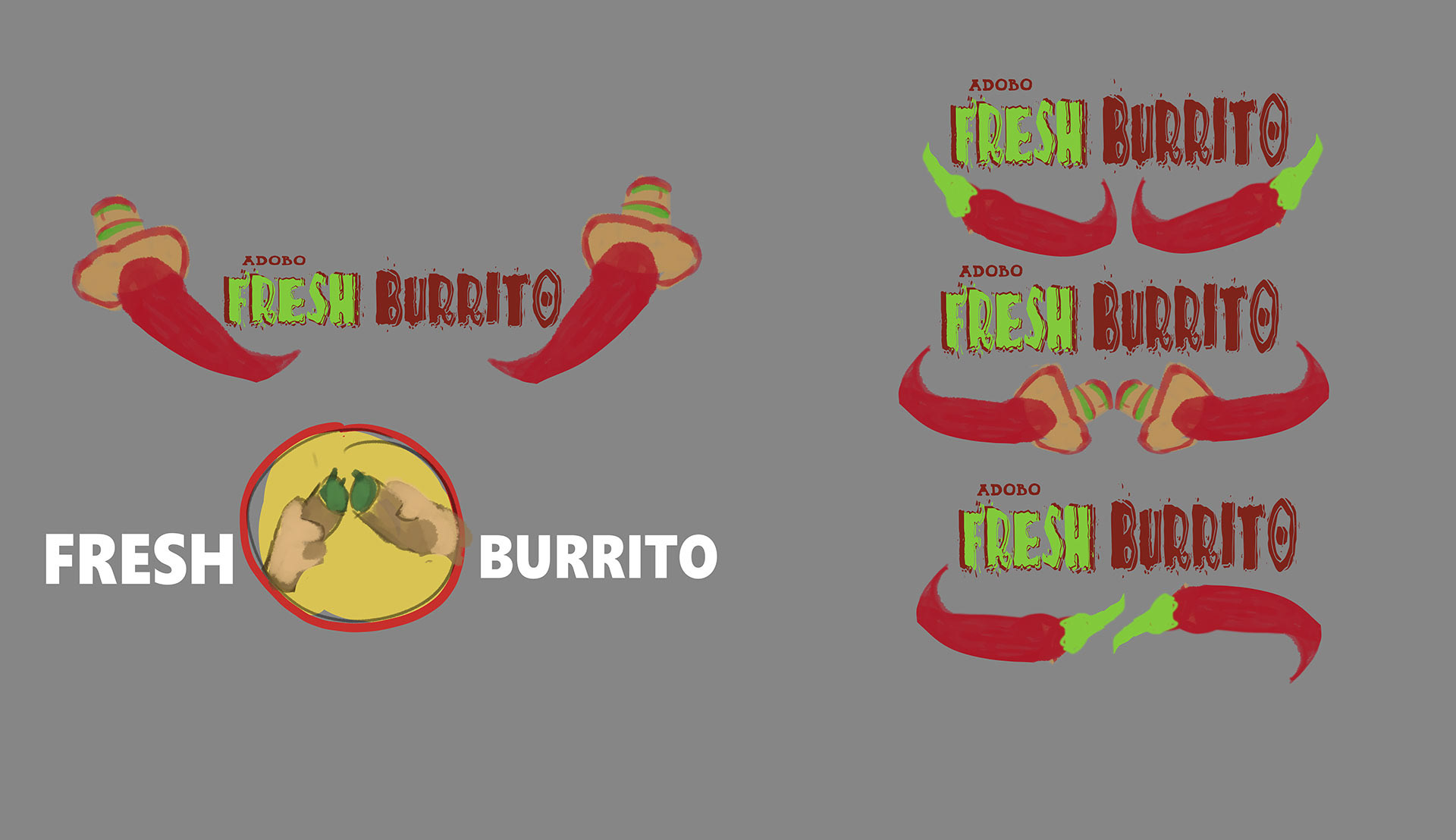
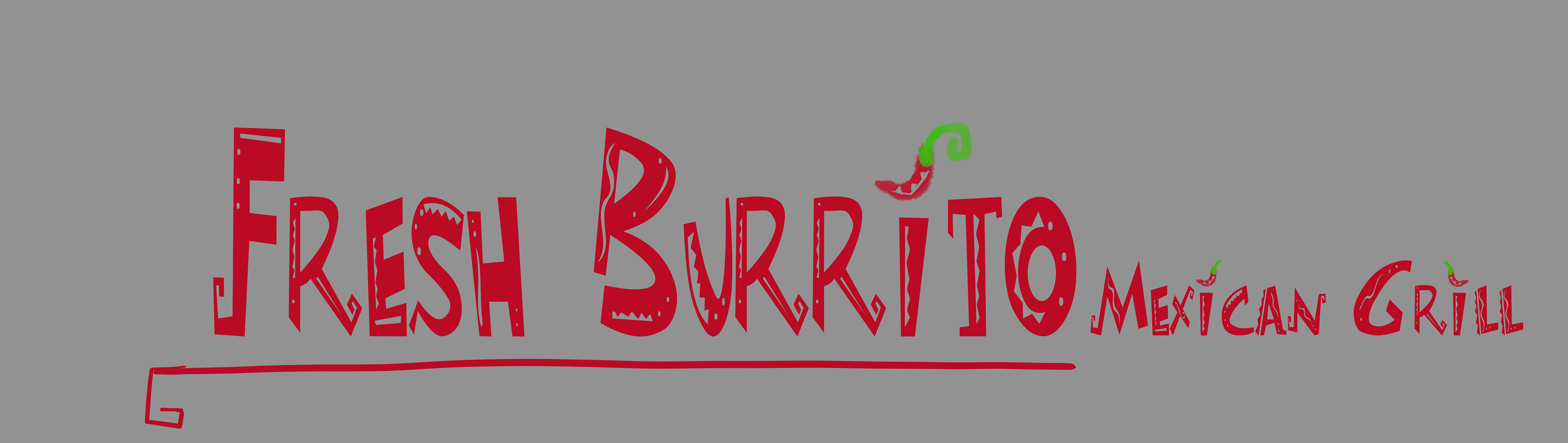
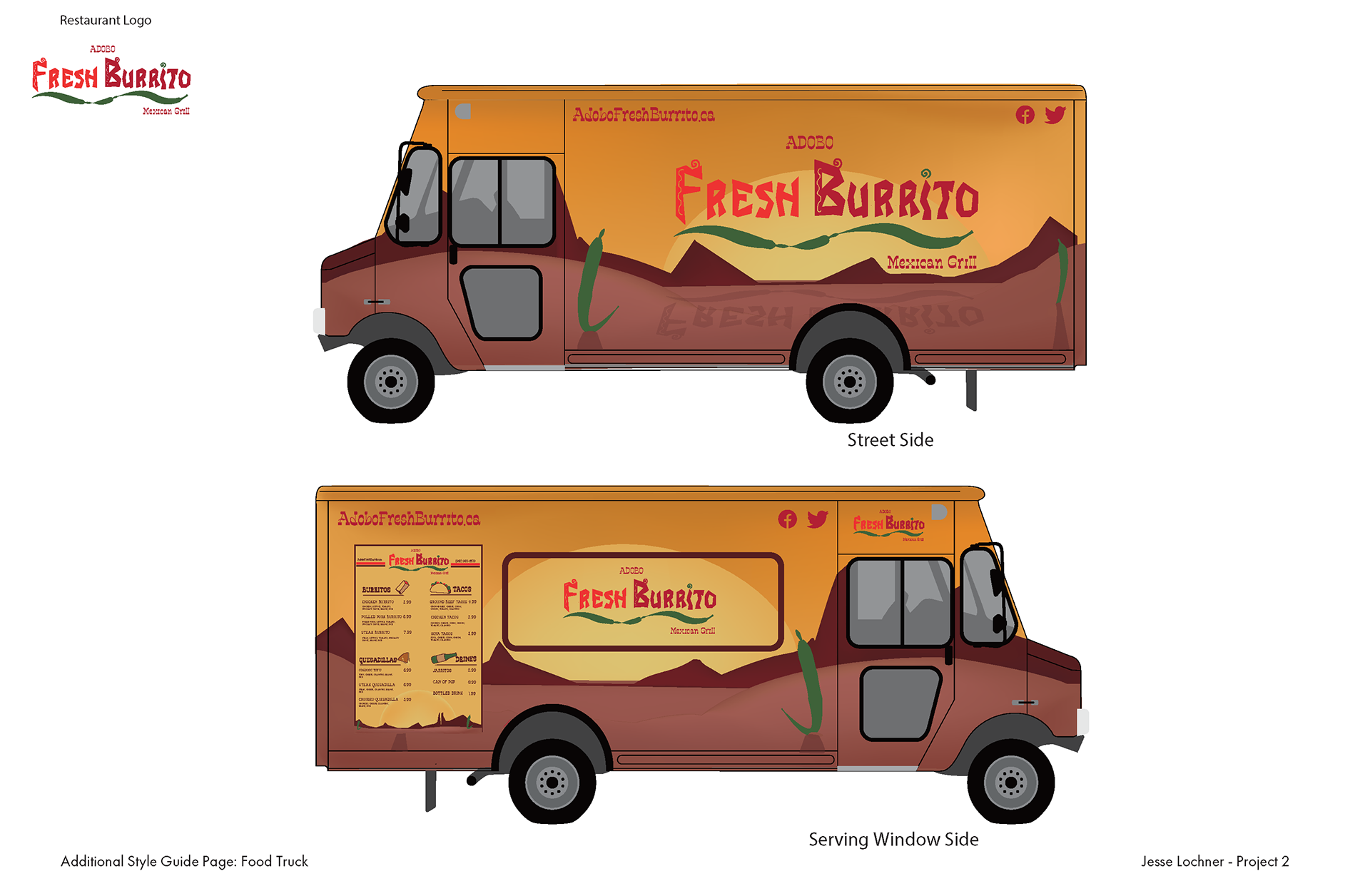
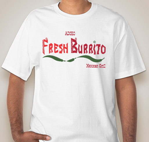
After my research and thumbnails, I developed three concepts in adobe illustrator. While I enjoyed all three of them, my second development was definitely the strongest. The typeface was energetic and certainly Mexican, and I manipulated the font within Illustrator to make it unique. Making the I a pepper was an incredible idea, and really made the logo soar. By using a green and red similar to the Mexican flag and having peppers throughout the design, the logo presented itself with many opportunities for marketing. The final can be seen across t-shirts, a food truck, and hats in all shapes and sizes, from the full wordmark to just the i. Being both traditional and flamboyant, this logo is a Mexican celebration in itself.
Medium/Tools Used
Clip Studio Paint, Adobe Illustrator
Clip Studio Paint, Adobe Illustrator

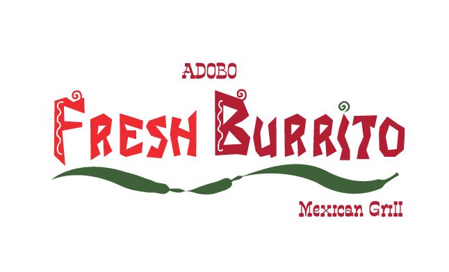
Original logo

Final logo