Objective
To design a logo representing a promotional event for white oaks mall.
Process
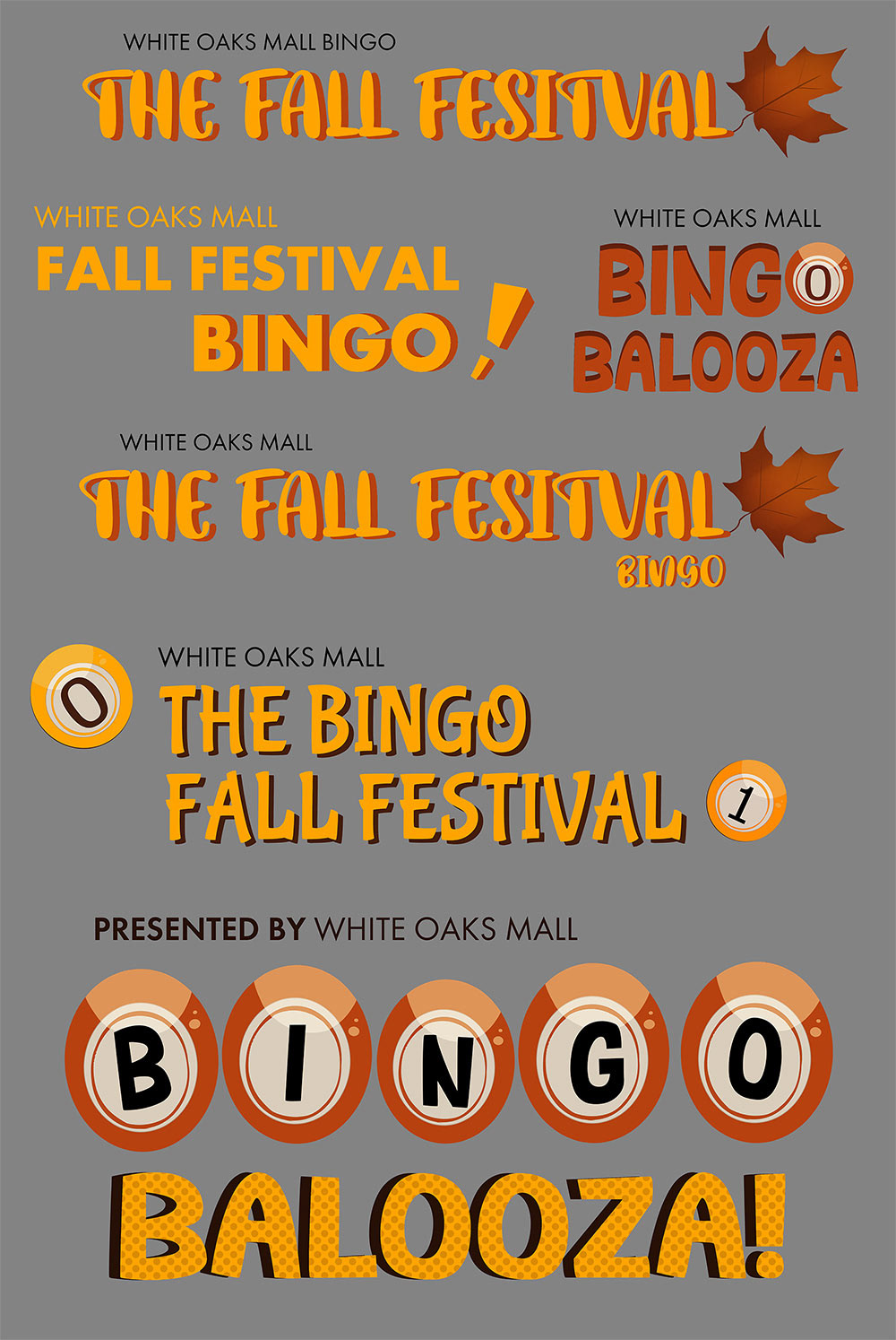
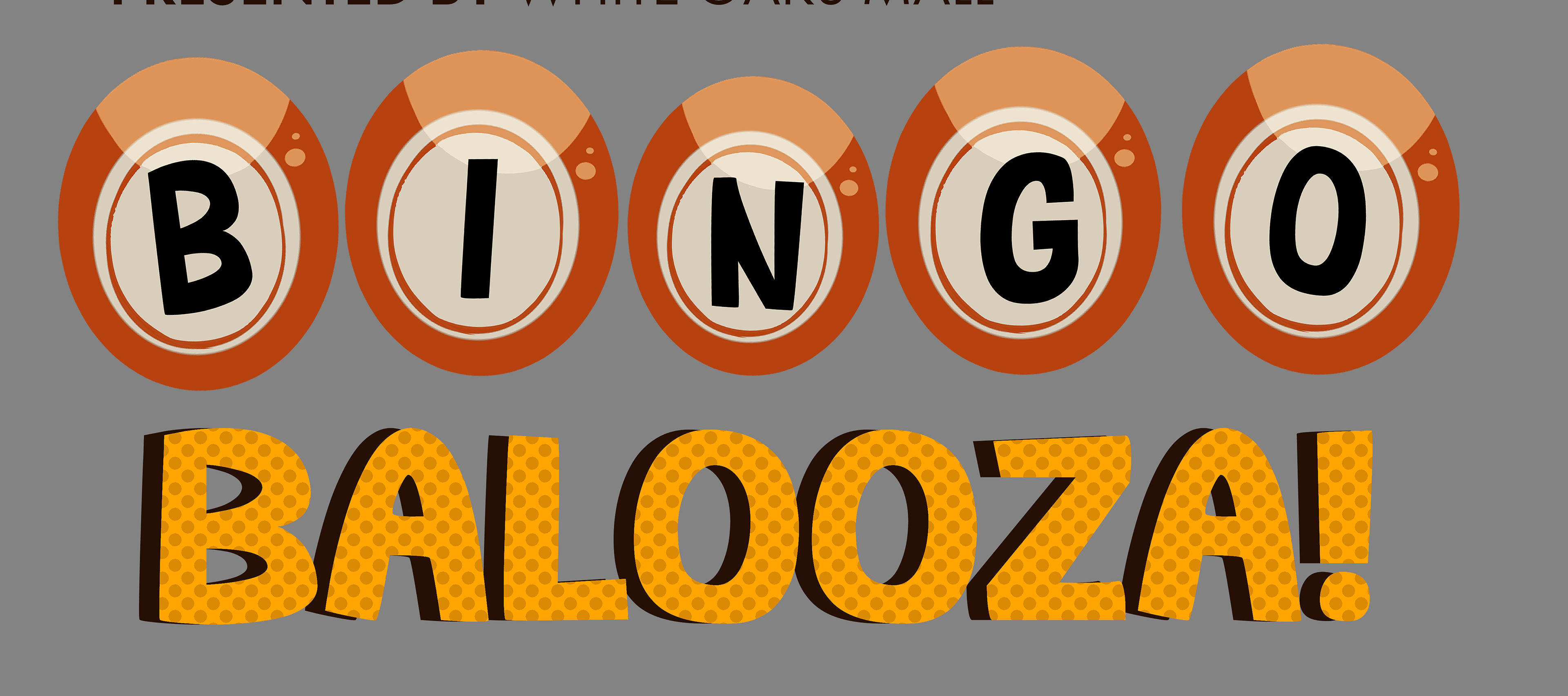
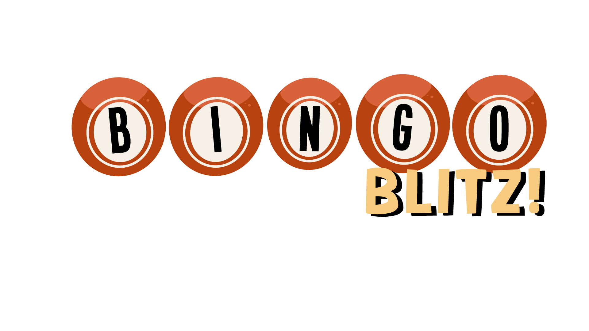
When approaching logo design, I understand that you only have five seconds to capture a viewer’s attention. With the purpose of this logo being to advertise the gamification of white oaks mall, my group and I chose a bingo game. Bingo can certainly be regarded for having a stigma; many think that it is only enjoyed by the elderly. However, this is far from true, and I needed this logo to represent that. With our event taking place in the fall, we chose orange, lively colors to capture the season’s essence. I used these colors when designing all of my logo concepts in clip studio paint. I went through many renditions, experimenting with the use of leaves and typography. But I always returned to the bingo ball found throughout many bingo machines.
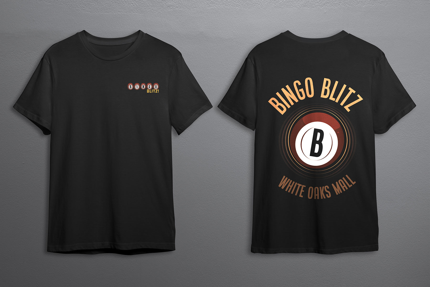
What started with one just on the B soon evolved into the entire word, and the logo’s design was starting to take shape. I then moved into Adobe Illustrator and finalized my logo. My original name was Bingo Balooza. However, my fantastic group members came up with a much better name; Bingo Blitz! This name conveyed what my initial goal was, and so the final logo came together nicely.
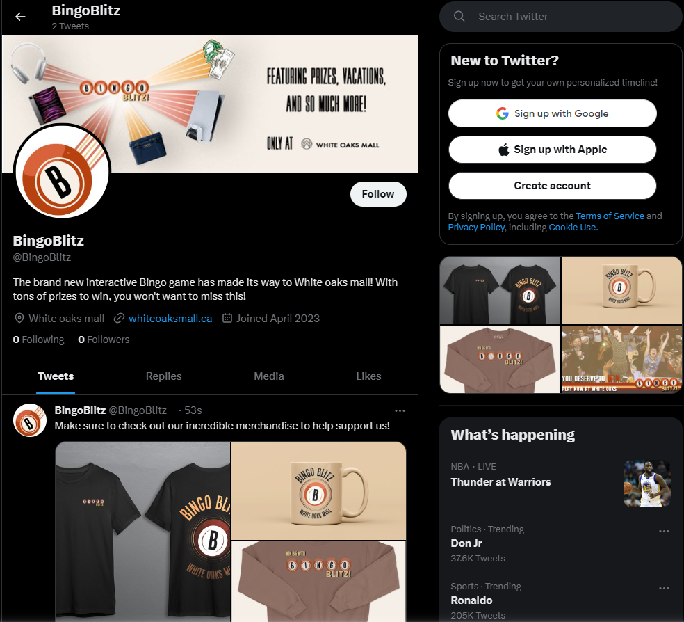
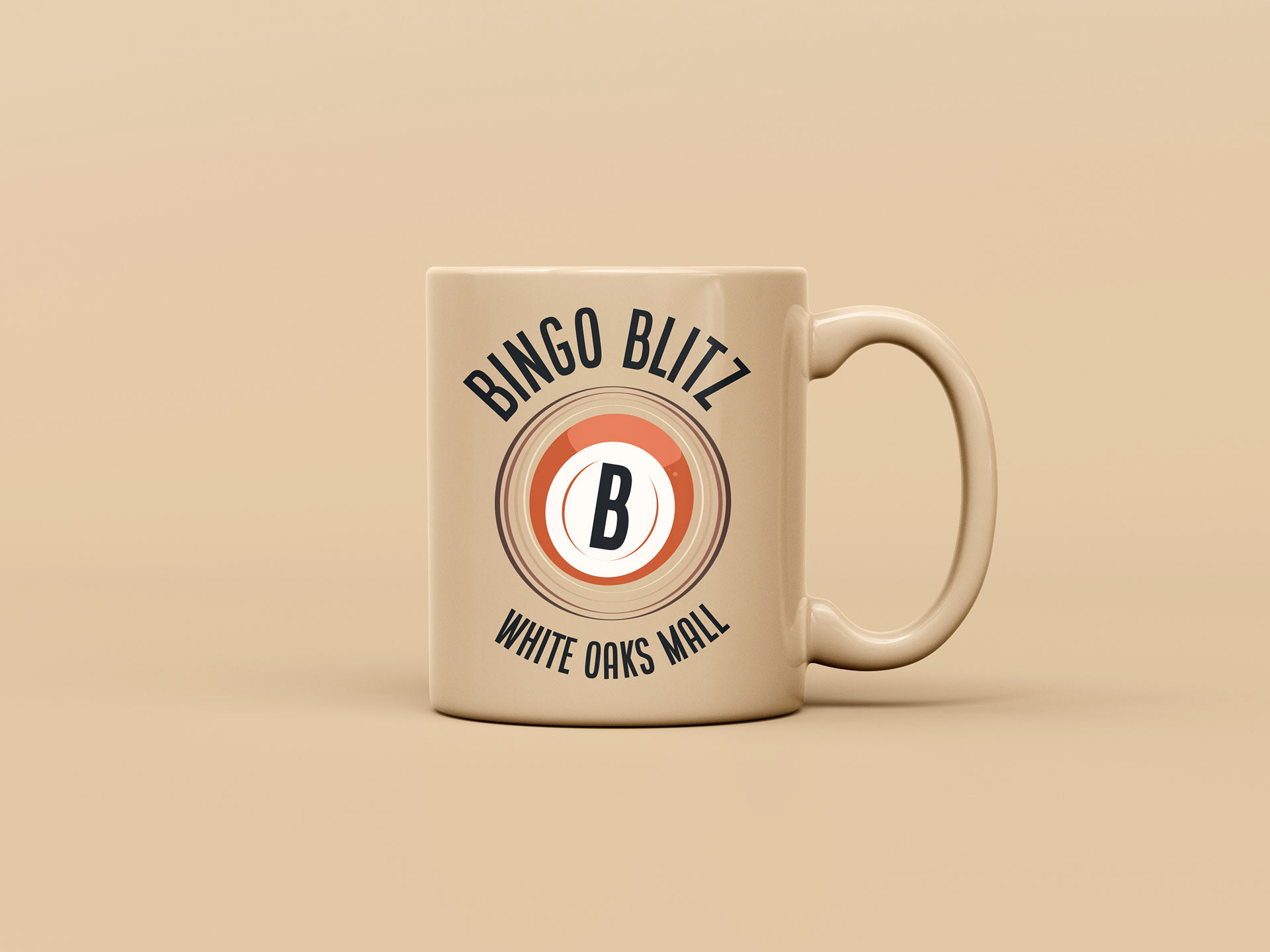
Through negotiation and teamwork, this logo was used throughout t-shirts, billboards, websites, and social media to build a strong and effective brand that will draw absolutely everyone into white oaks mall.
Medium/Tools Used
Clip Studio Paint, Adobe Illustrator