Objective
To develop, illustrate, and design the packaging for an original coffee blend.
process
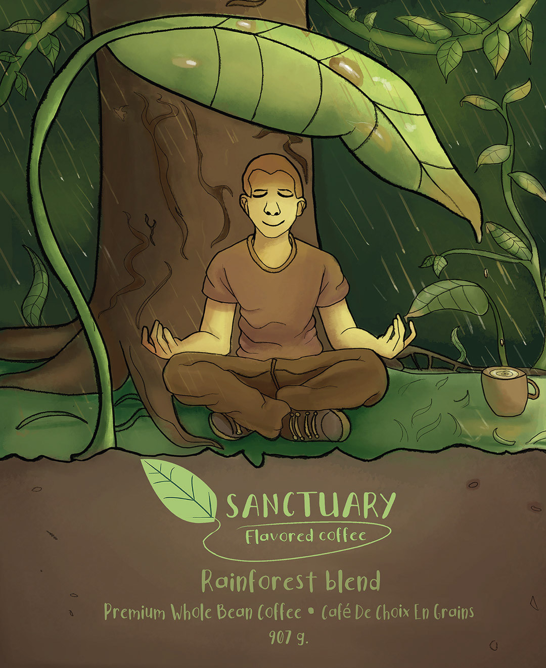
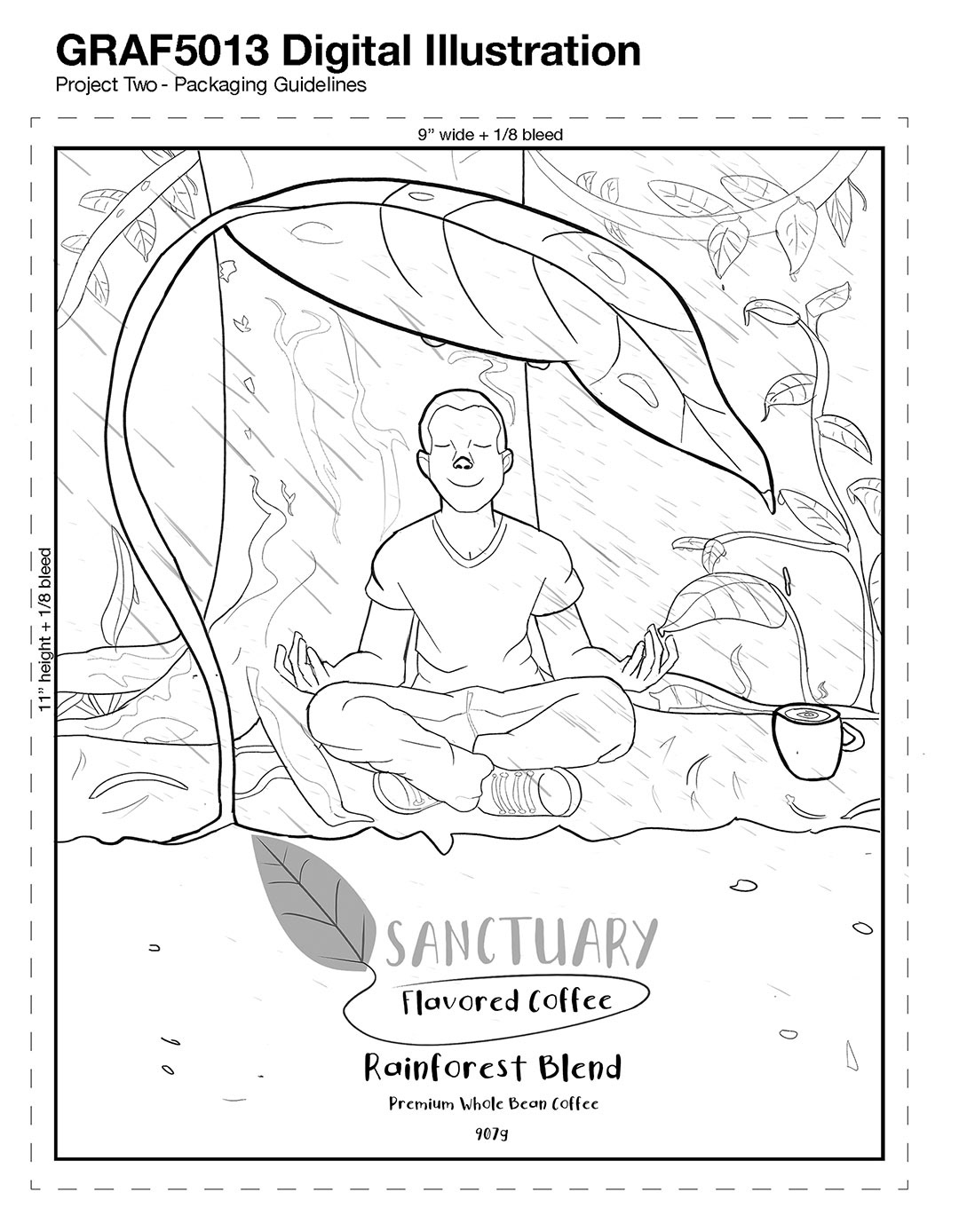
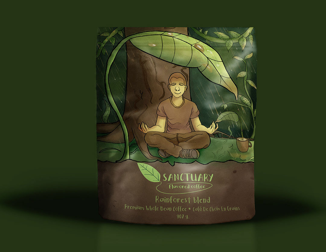
As a non coffee drinker, designing this project was yet another intriguing challenge. I first did some research on coffee brands, and found that many people drink it to find ease and calm within oneself. That was something I realized I fundamentally understood. I created the logo and chose the name sanctuary to symbolize the feeling of cozying up in your own home; with just you and your coffee, enjoying the sunlight rays casting throughout your window in the early morning. I wanted the illustration I developed to convey something similar. I chose the landscape of a rainforest, something so relaxing and meditative, and combined it with the act of meditation itself. This easily produced a relieving mood that began to tie things together. I made sure the typography was also as playful as the logo, taking the edge off and not dragging down the composition. Using a chalk texture to produce the linework and developing a yellow, green, and light brown color scheme, the final result makes anyone feel at ease in an instant. The end result will turn any coffee enjoyer’s heart warm as their drink.
medium/tools used
Clip Studio Paint, Adobe Photoshop, Adobe Indesign