Objective
To design and illustrate a brand new blend of craft beer
and display it on a bottle.
To design and illustrate a brand new blend of craft beer
and display it on a bottle.
Process
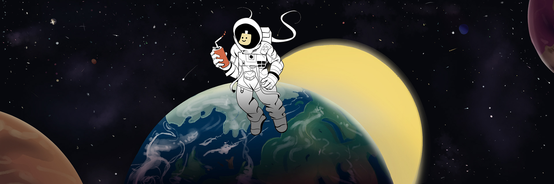
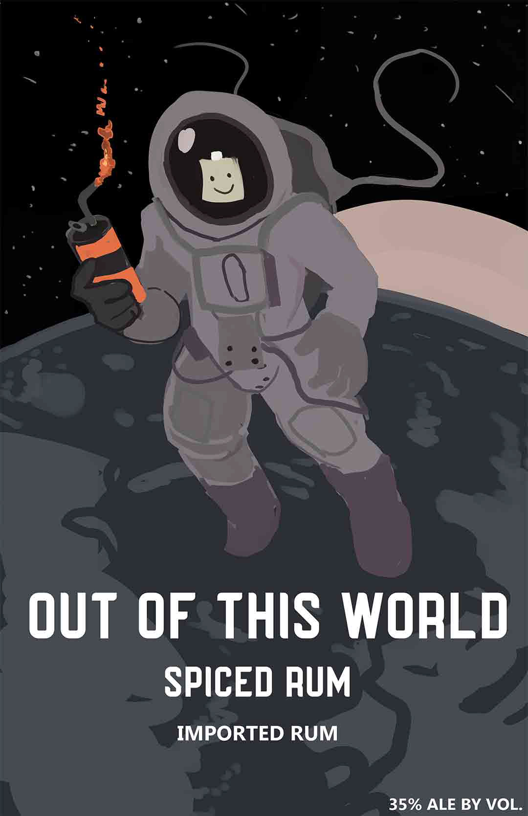
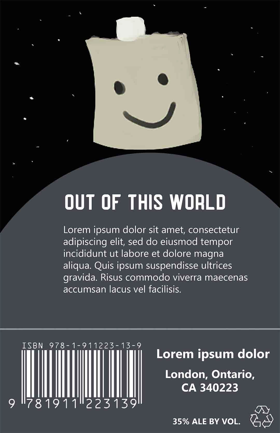
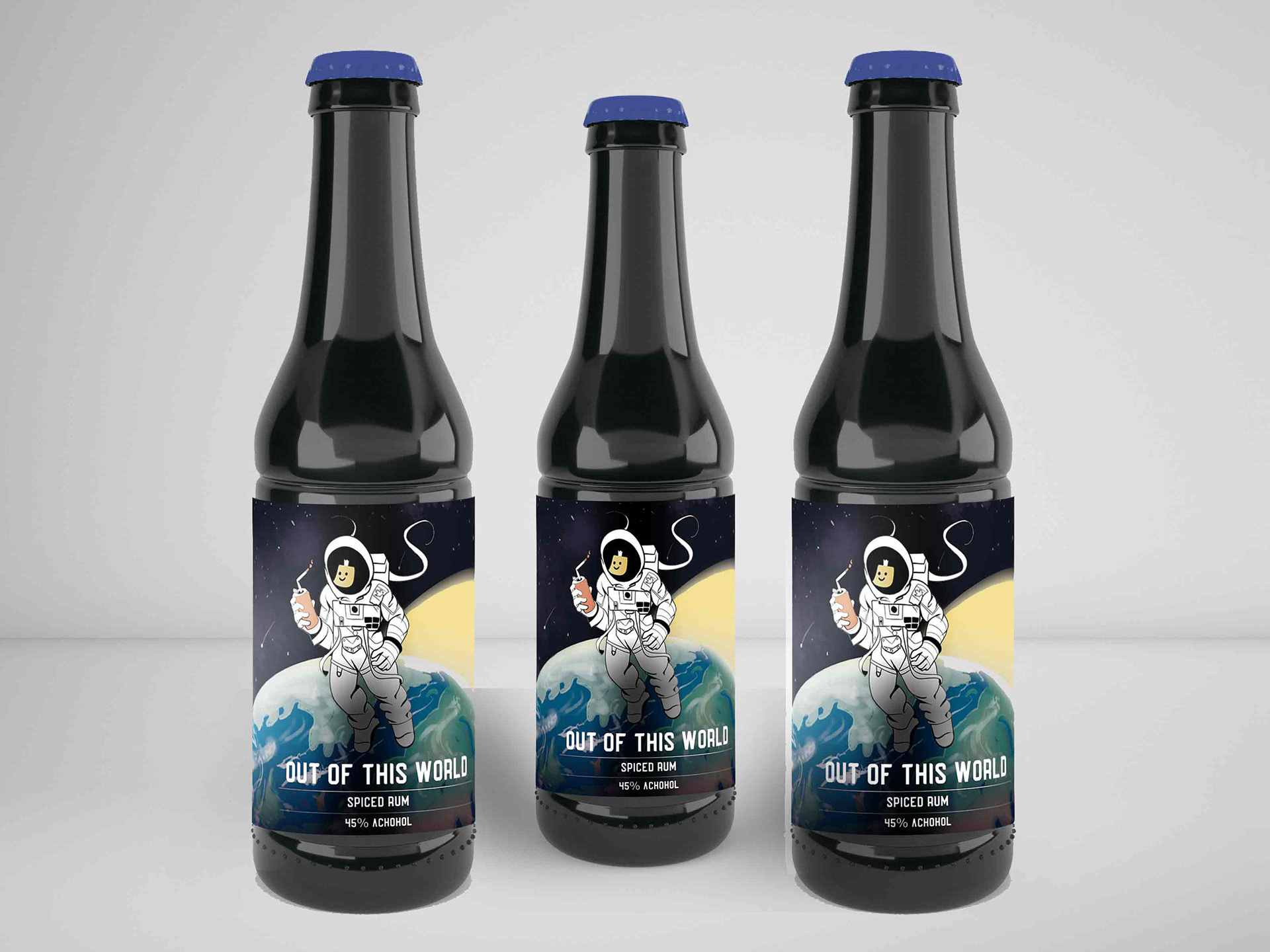
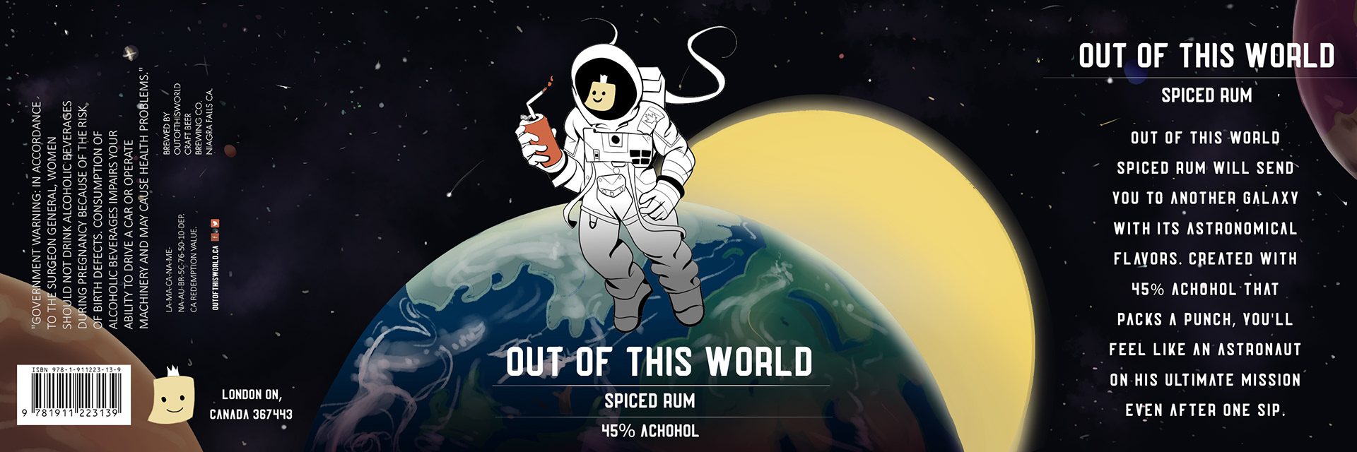
Developing a label for a craft beer opened me to endless opportunities. Design truly flourishes on alcohol packaging: you can get anything from pure minimalism to detailed illustrations. Keeping this in mind, I remembered why people drink alcohol in the first place; to have fun and take the edge off. After acknowledging this, I settled on a space theme.
When developing the illustration, I started with an in color thumbnail first, trying to capture the atmosphere of space and escapism. I settled on a simplistic typeface that still looked futuristic but did not distract from the final design. Moving onto the final, I poured all of my skills into shading and rendering the background in clip studio paint. I also included the added touch of a sticky note with a smiley face onto the astronaut’s helmet. Not only does it introduce a great focal point and some charm, it also communicates the astronaut’s mood. Looking at the final illustration, typography, and layout, the name speaks for itself; this alcohol will truly make you feel like you are out of this world.
Medium/tools used
Clip Studio Paint, Adobe Photoshop, Adobe Dimensions